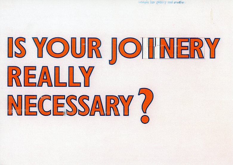
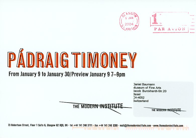
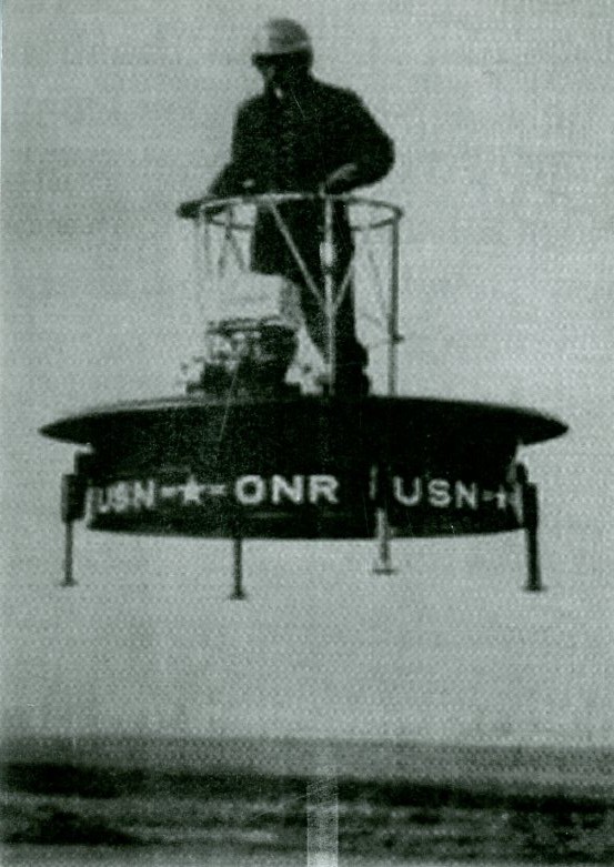
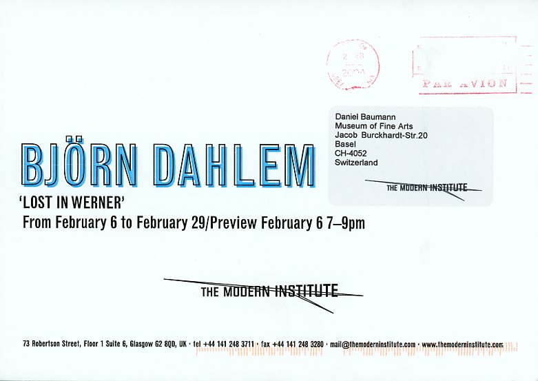
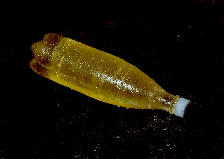
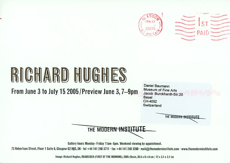
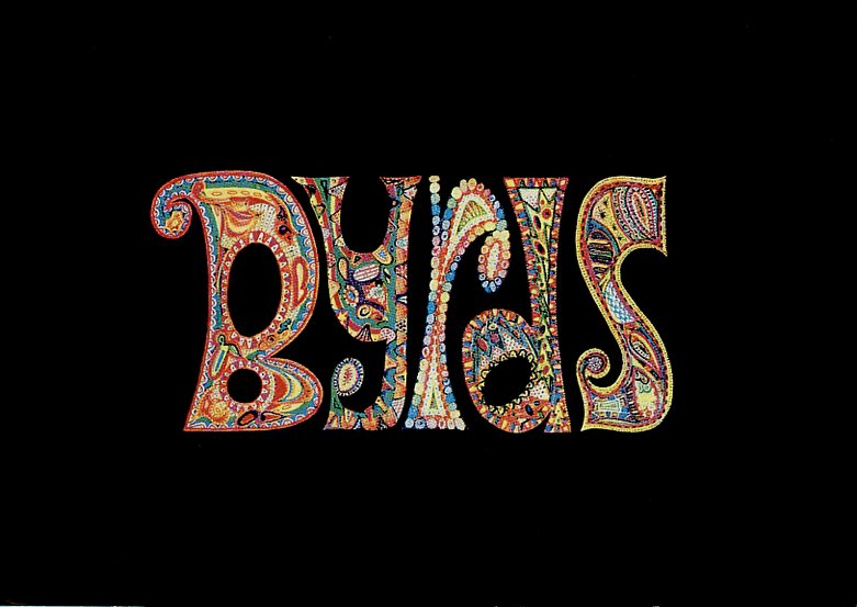
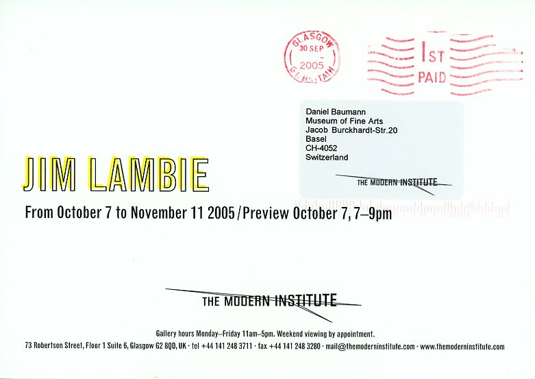
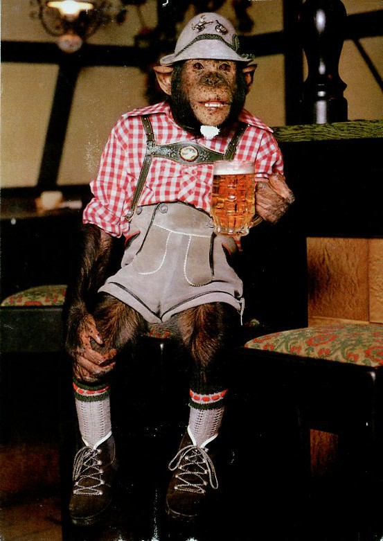
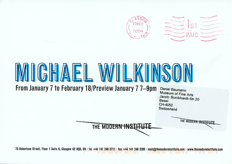
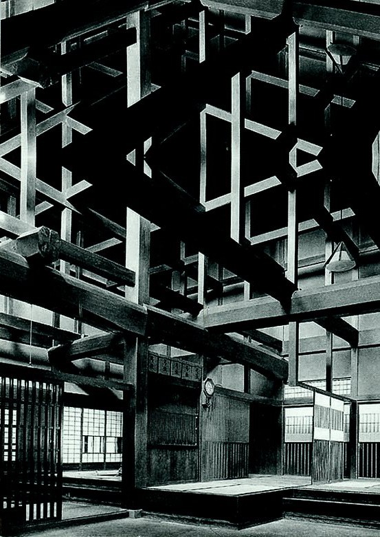
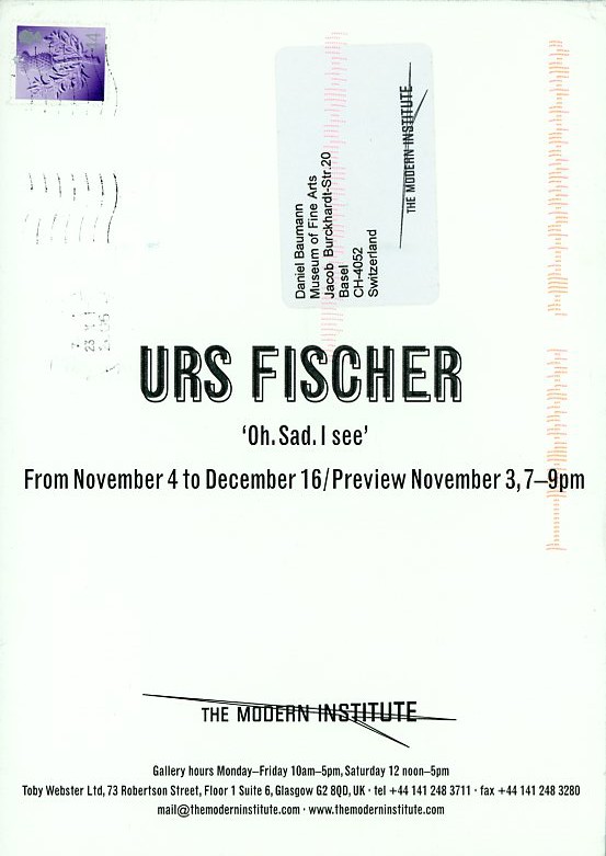
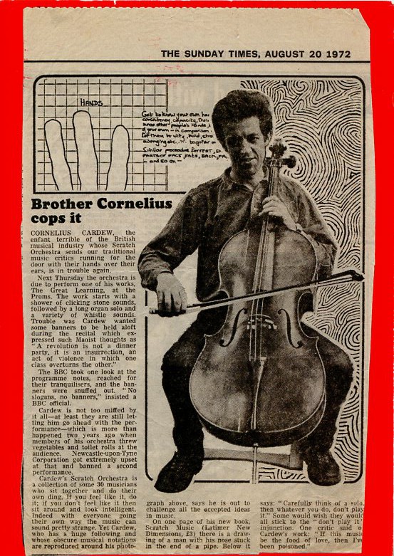
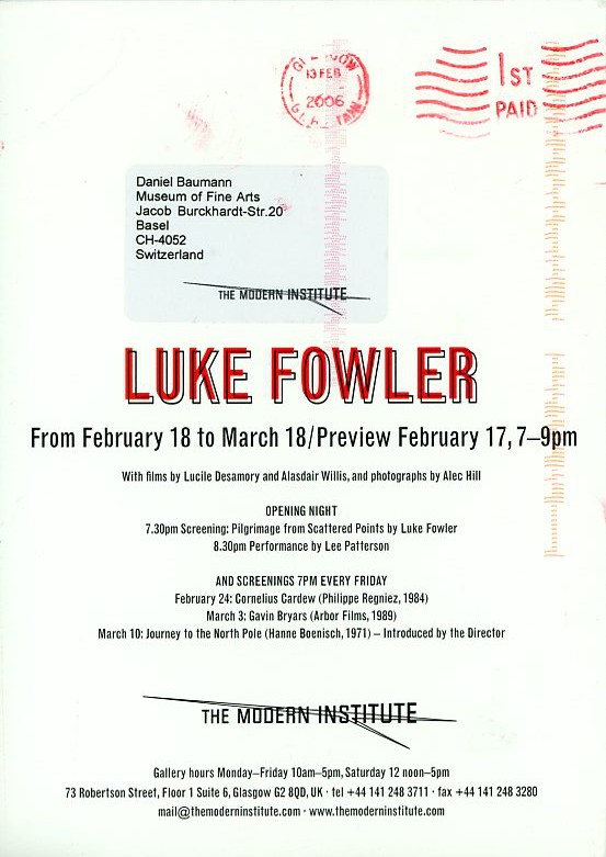
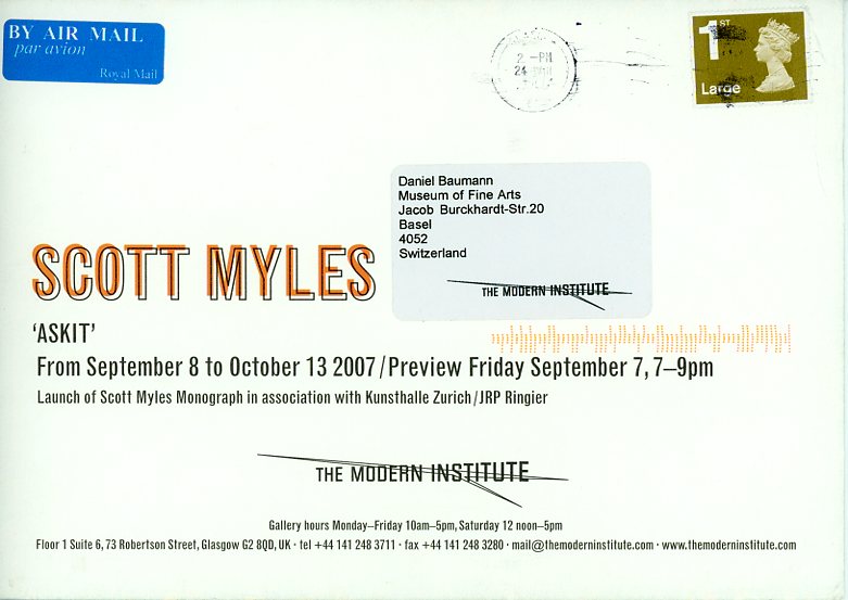
A small selection of the invitation cards by The Modern Institute. Toby Webster established The Modern Institute in 1997 in Glasgow, in partnership with former Tramway and current Van Abbemuseum Director, Charles Esche, and writer and curator Will Bradley. For many years, The Modern Institute sent out these very simple, great, sometimes funny, sometimes conceptual announcements. The gallery’s logo was designed by Toby Webster, so were the cards, and in the very beginning, he hand fed them through a riso machine. As Matthew Marks’ invitation cards, they deserve a retrospective or being part of a design museum. Or both.
As many of the new young galleries established in the mid to late nineties, The Modern Institute (est. 1997) used their invitation cards to highlight individuality and as an innovative form of (self-)branding. Invitation cards could become an art project, and a space where art may happen – and is distributed worldwide for free. A similar strategy was adopted by other young up-and-coming galleries such as neugerriemschneider, Berlin (est. 1994), Gavin Brown’s Enterprise, New York (1994-2020), CFA Contemporary Fine Arts, Berlin (est. 1992), The Modern Institute, Glasgow (est. 1997), Meyer Riegger Galerie (est. 1997 in Karlsruhe, since 2008 also in Berlin) or Eva Presenhuber (Galerie Walcheturm 1989-1998/Galerie Eva Presenhuber).
Rirkrit Tiravanija, Glasgow 1999
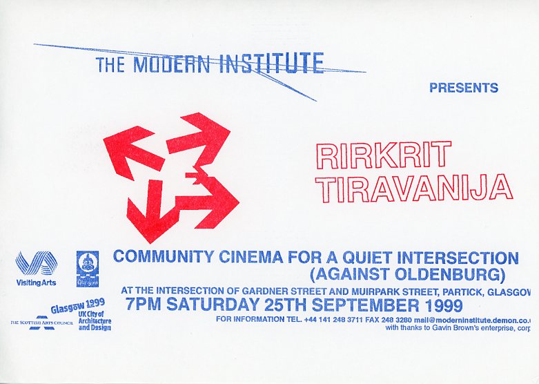
Community Cinema For a Quiet Intersection (Against Oldenburg) was an early, community-driven project by Rikrit Tiravanjia in Glasgow 1999. Here some pictures on flickr.
“The Thai artist Rikrit Tiravanja created the installation Community Cinema For a Quiet Intersection (Against Oldenburg) as part of the City of Architecture Festival in Glasgow, Scotland, in September 1999. He created a temporary outdoor cinema composed by four screens and accompanied by a Thai café right on the traffic intersection in a residential neighbourhood in Glasgow and after dusk showed films that had been chosen by the local community: Casablanca, A Bug’s Life, The Jungle Book and It’s a Wonderful Life were shown in parallel on the our screens.” Anna Schober, The Cinema Makers: Public Life and the Exhibition of Difference in South-Eastern and Central Europe Since the 1960s .
Spencer Sweeney – MiLLion dollar Paintings
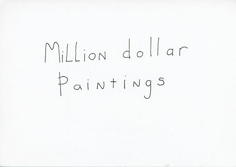
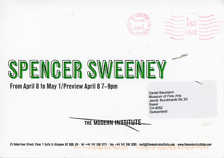
Invitation by Spencer Sweeney for his successful show at The Modern Institute in 2005 in Glasgow. Design by Toby Webster.
User comment: “Die auffälligste Einladung stammt von Spencer Sweeney: in betont simpler Handschrift steht ‘Million dollar Paintings’, was gleich die Diskrepanz von Realität des Künstlertums und Ambition aufzeigt.” Michael Kathe
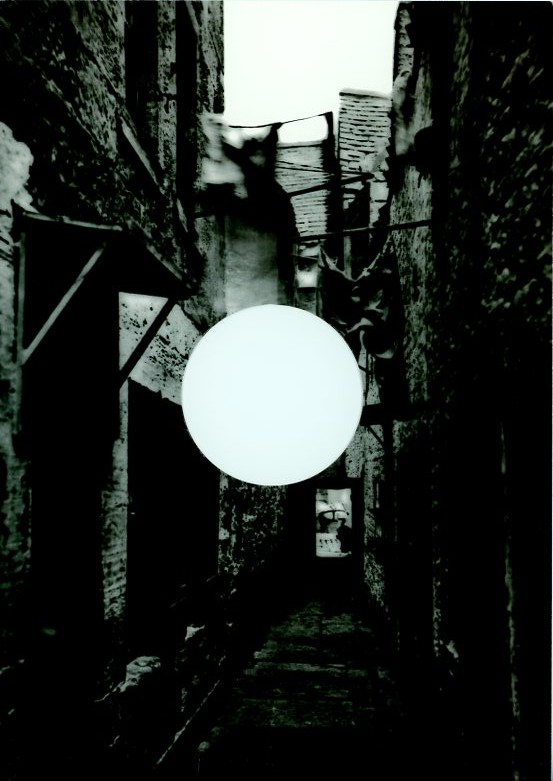
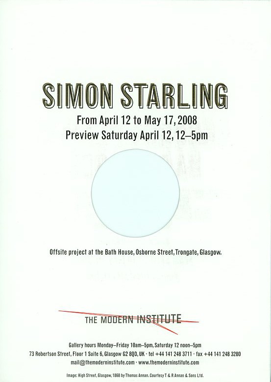
Simon Starling “Tabernas Desert Run”
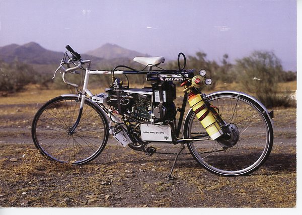
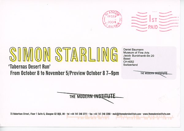
Starling crossed the Tabernas Desert in Spain on a bicycle powered by compressed hydrogen in September 2004. The only biproduct of the journey was water which was used to produce the cactus painting.
User comment: “Der Traum jedes Weltreisenden!” Speziell meines Cousins, welcher 2x per Velo den Planeten umradelte.” Beat
Mary Redmond
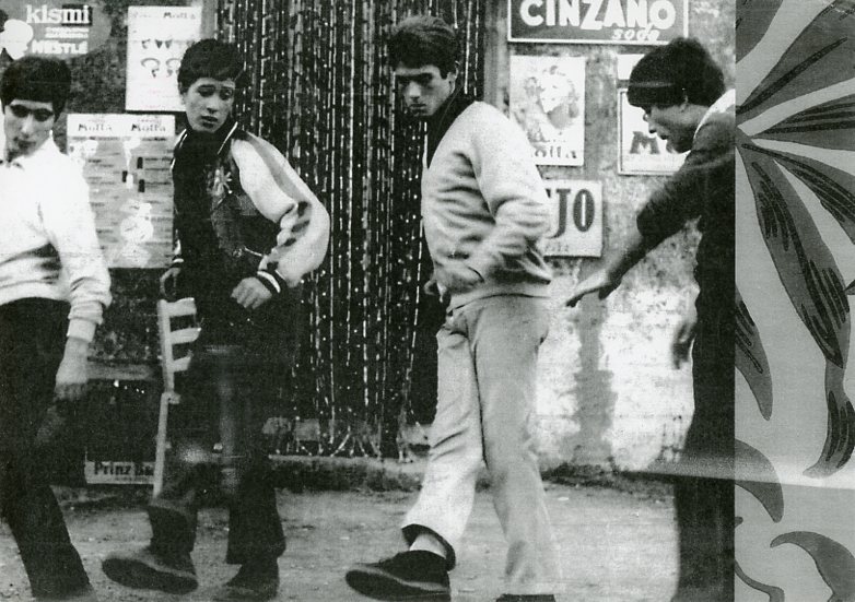
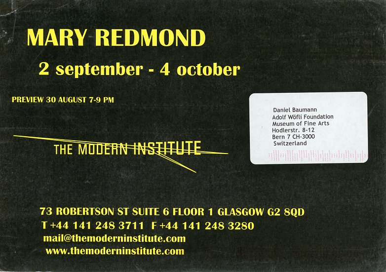
Invitation card for an exhibition by Mary Redmond at the Modern Institute in Glasgow. Somebody said that it reminded her or him of John Travolta.
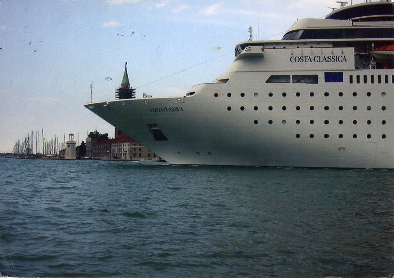
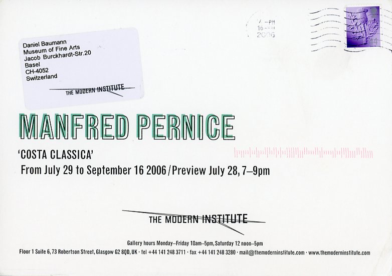
Manfred Pernice: Costa Classica
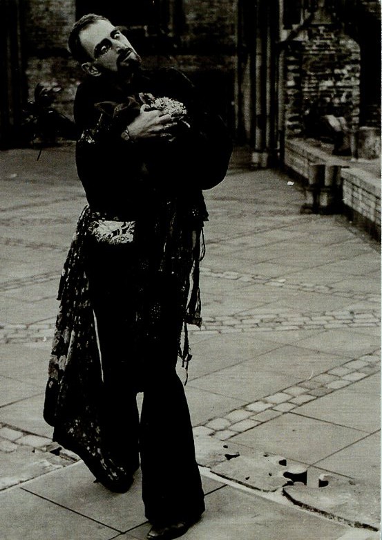
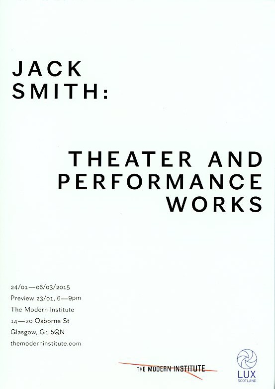
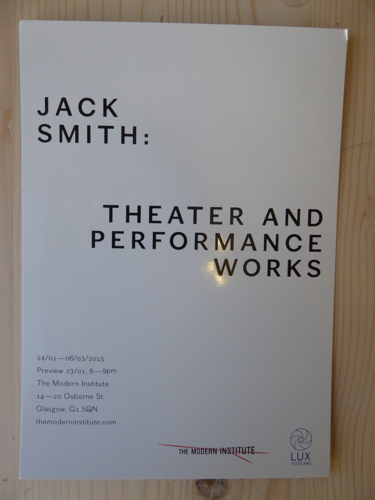
Jack Smith
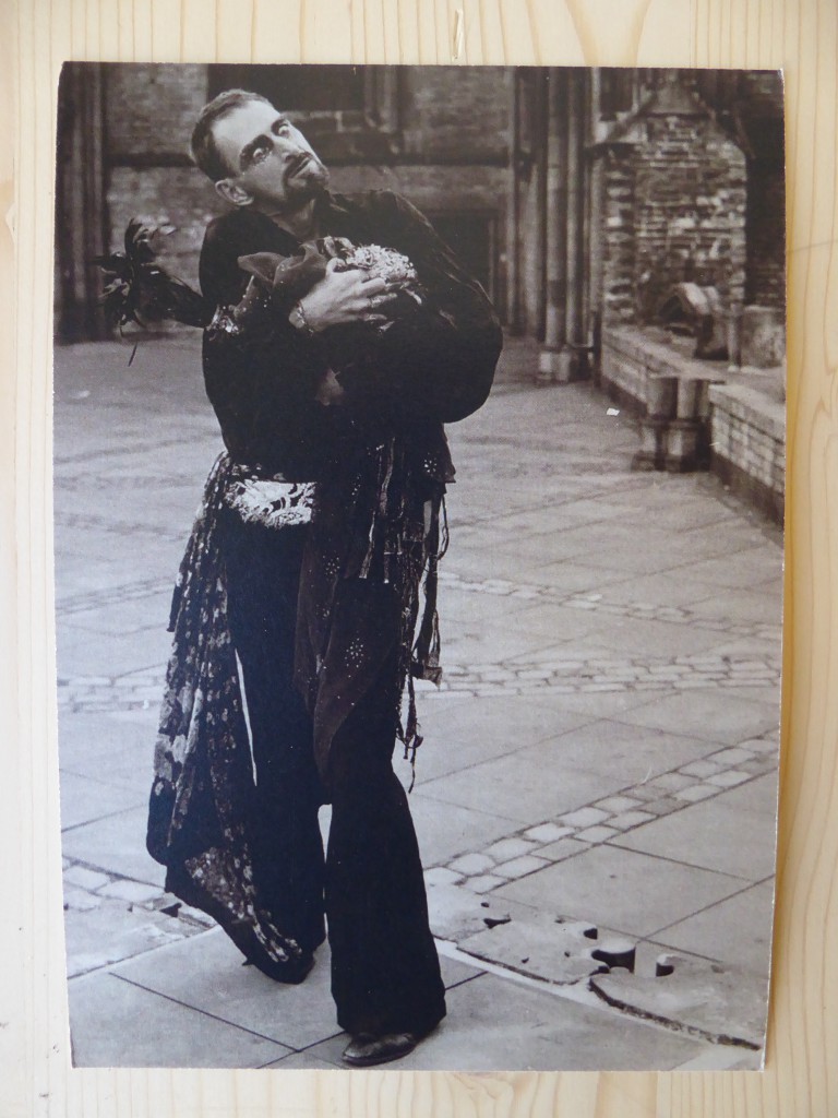
Anonymous user comment: “Interesting how an image of one person’s work can instantly remind you of another’s. I thought immediately about a performance done by the Georgian artist Mamuka Japaridze where he walked through the streets of Tbilisi dressed in a similar way. I tried to find some images of it to post here but alas I could not find any.”
The Modern Institute/Toby Webster Ltd
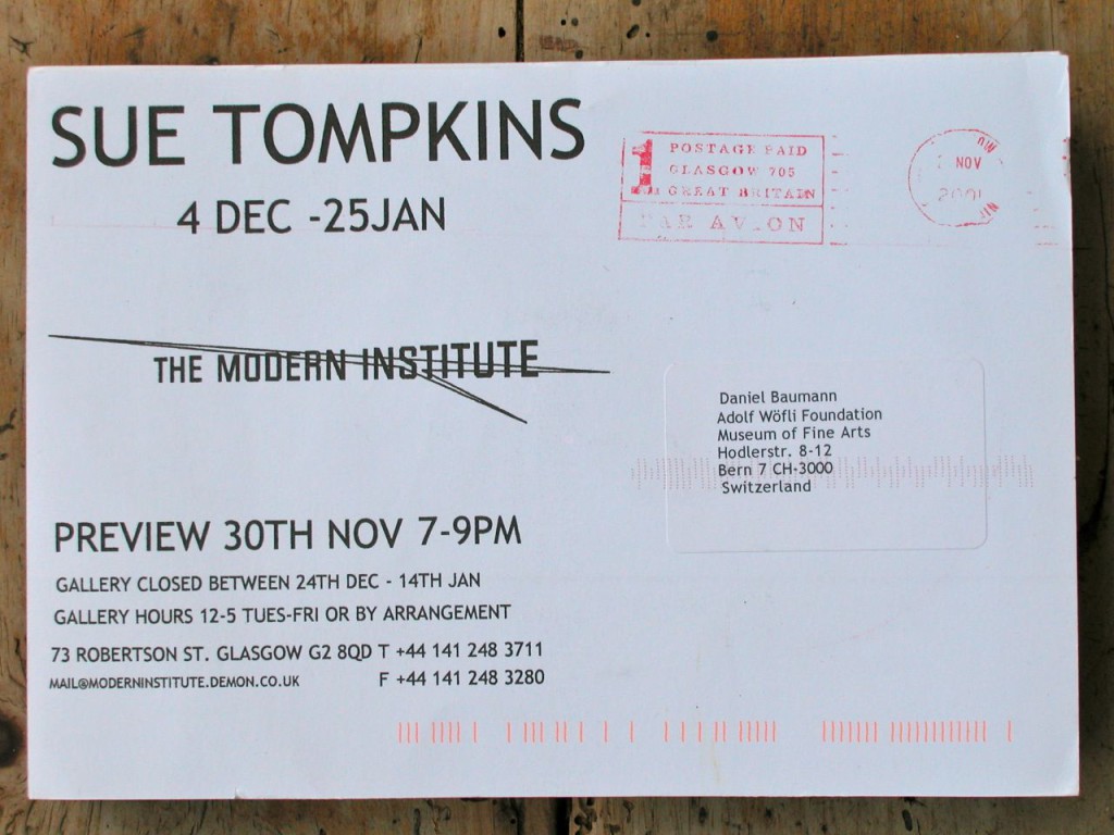
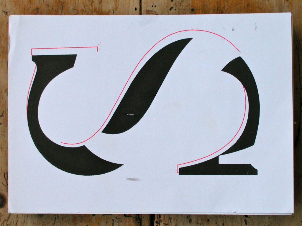
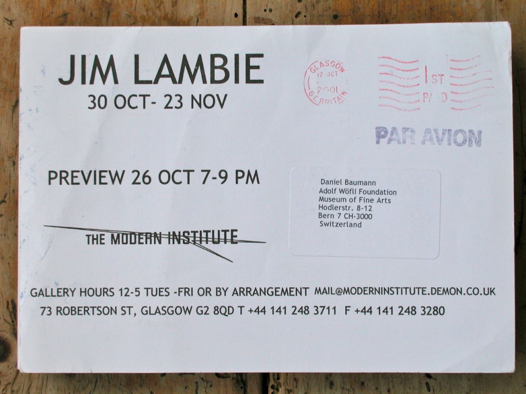
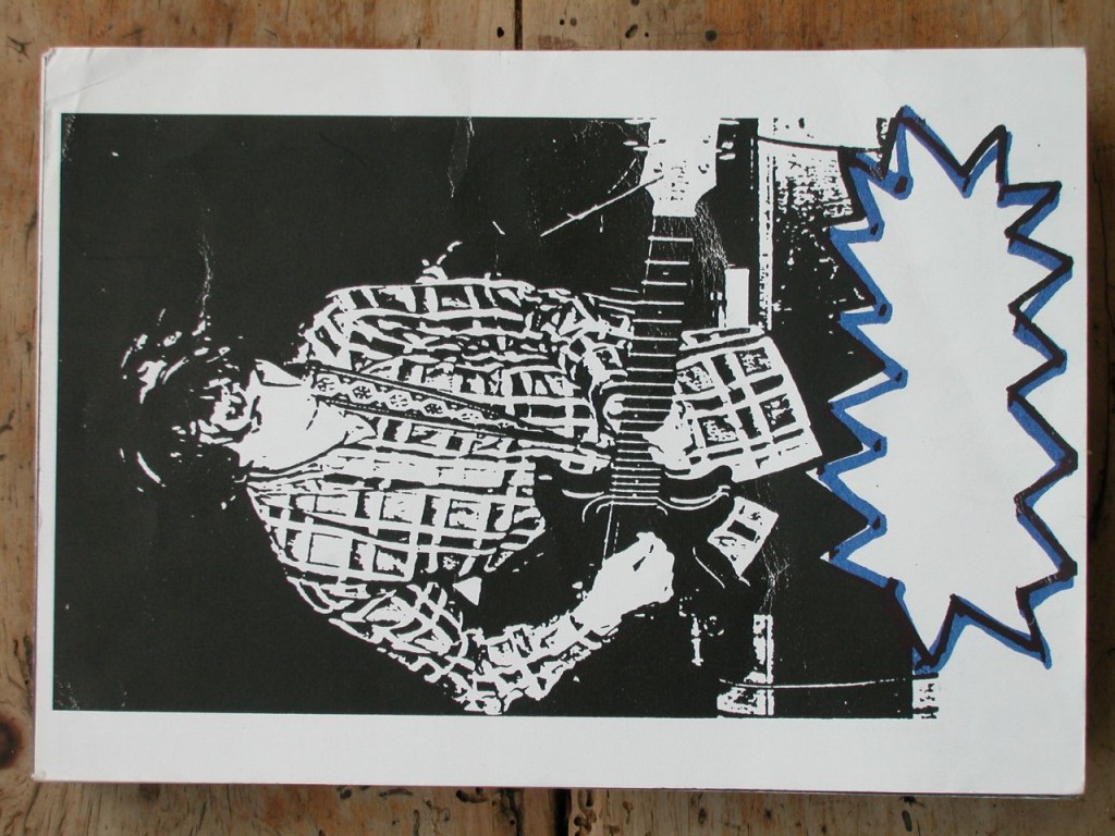
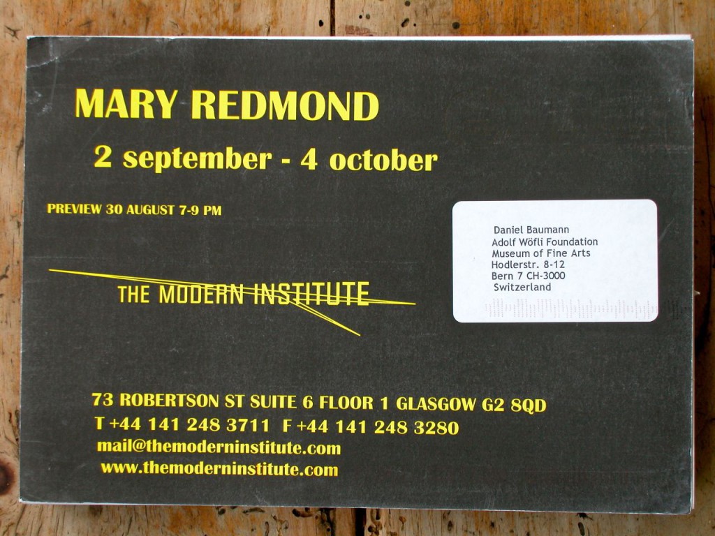
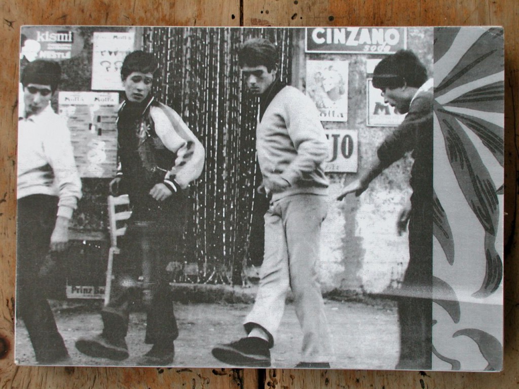
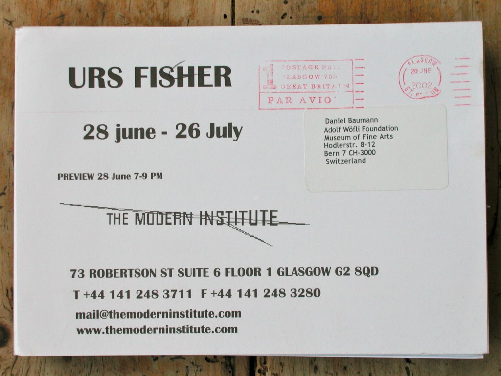
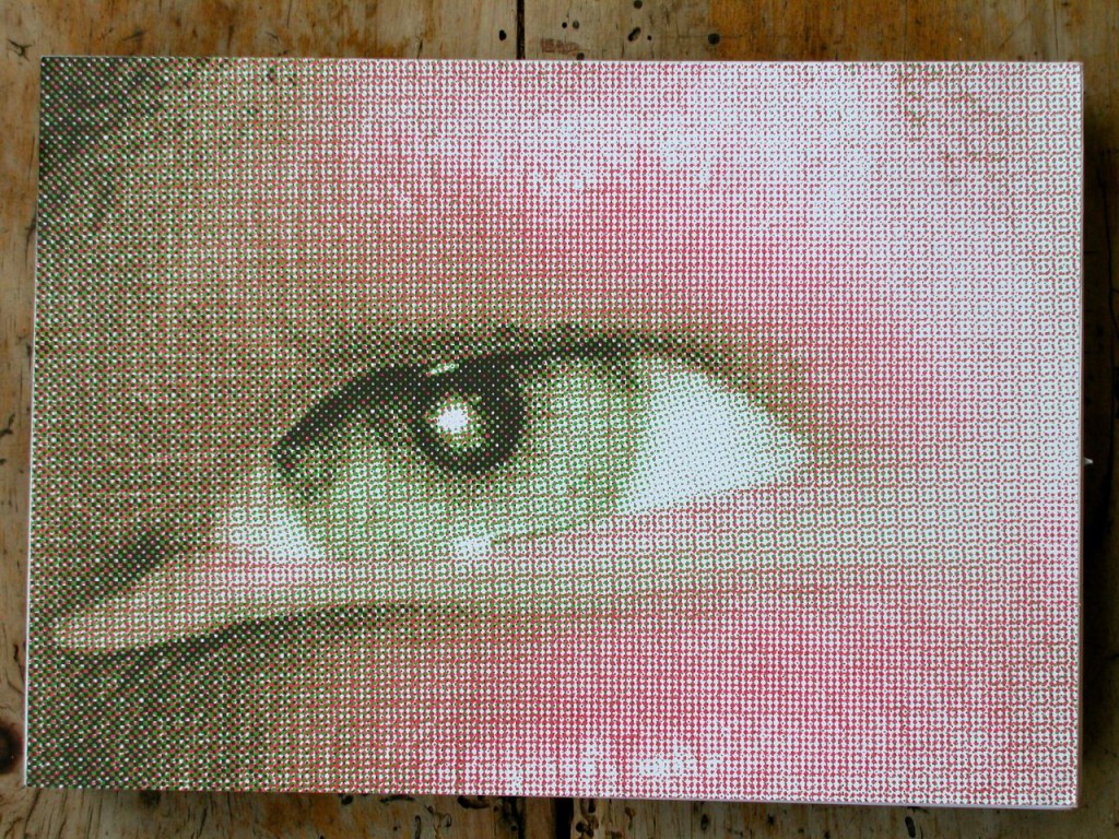
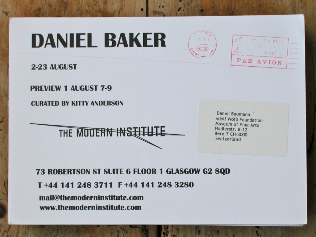
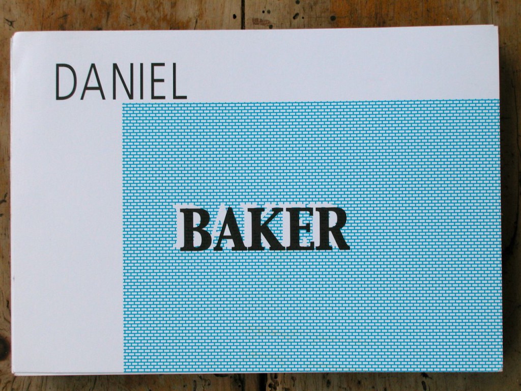
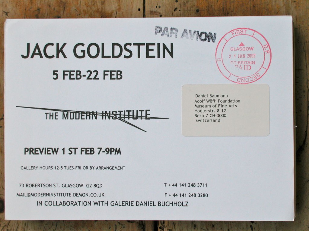
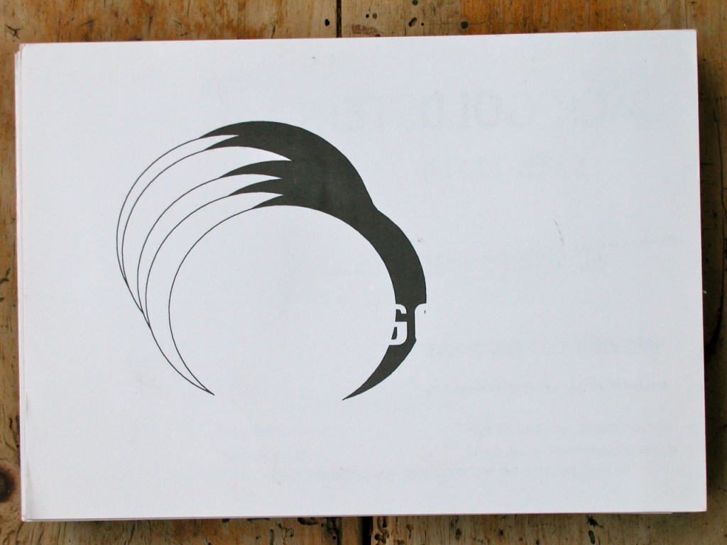
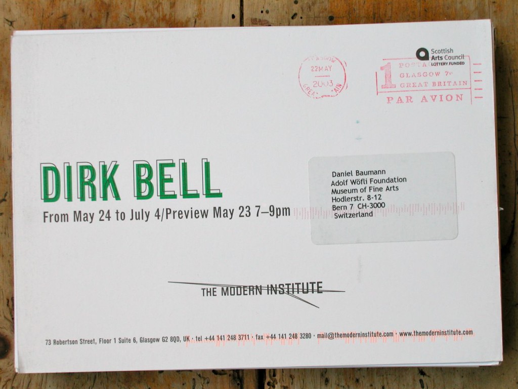
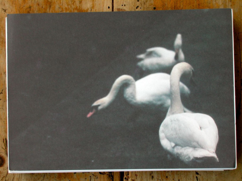
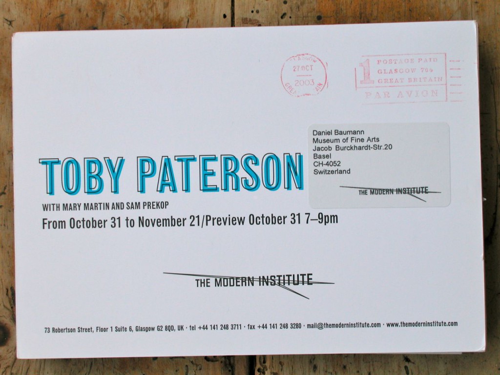
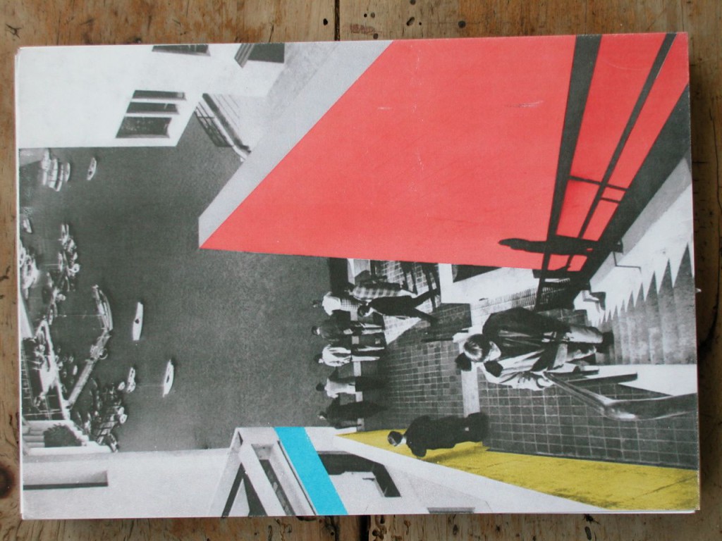
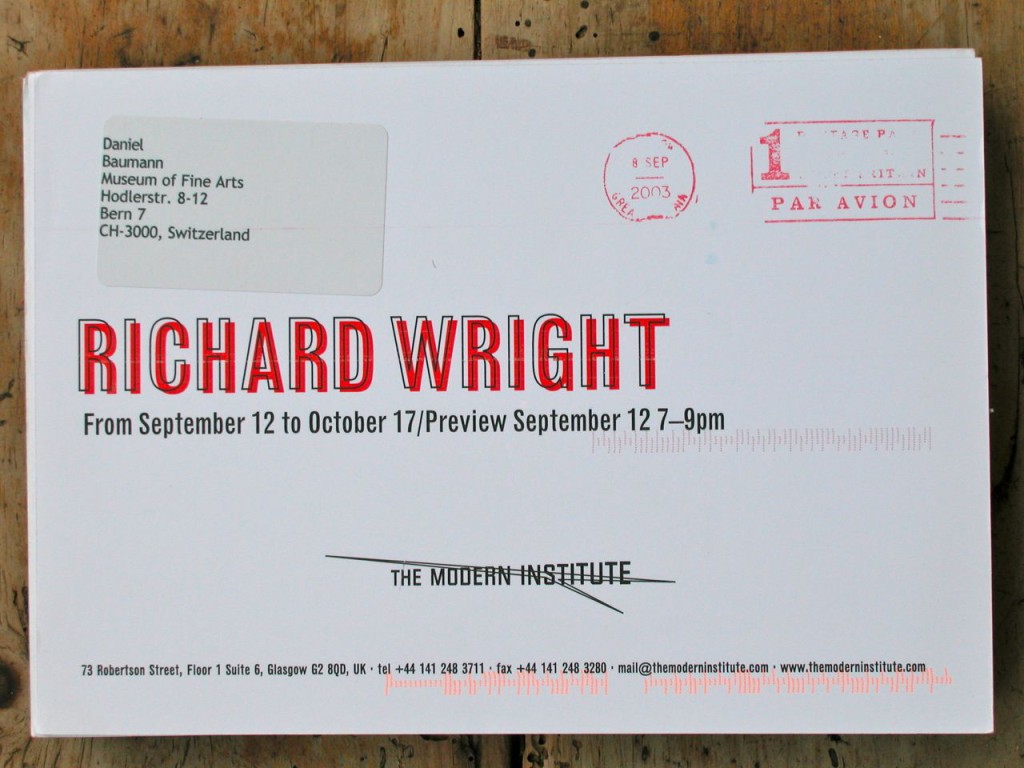
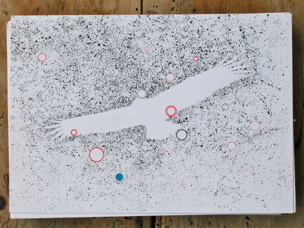
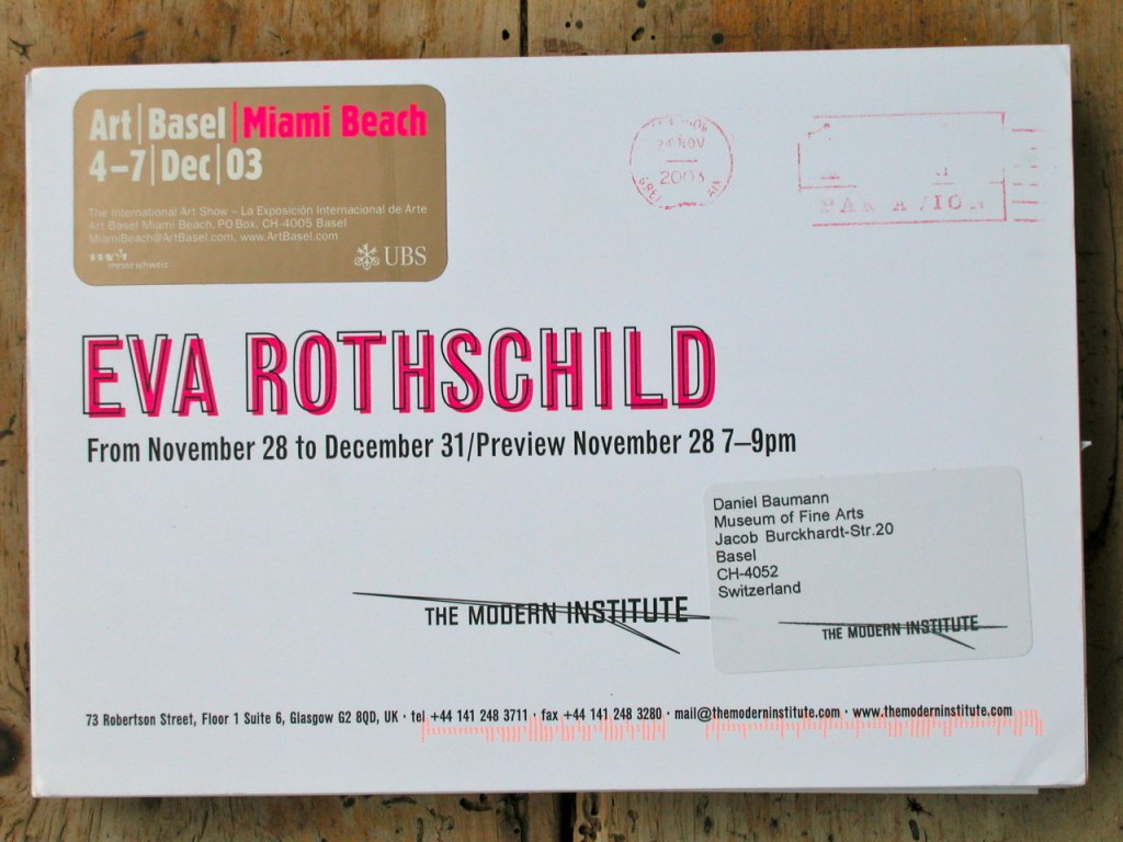
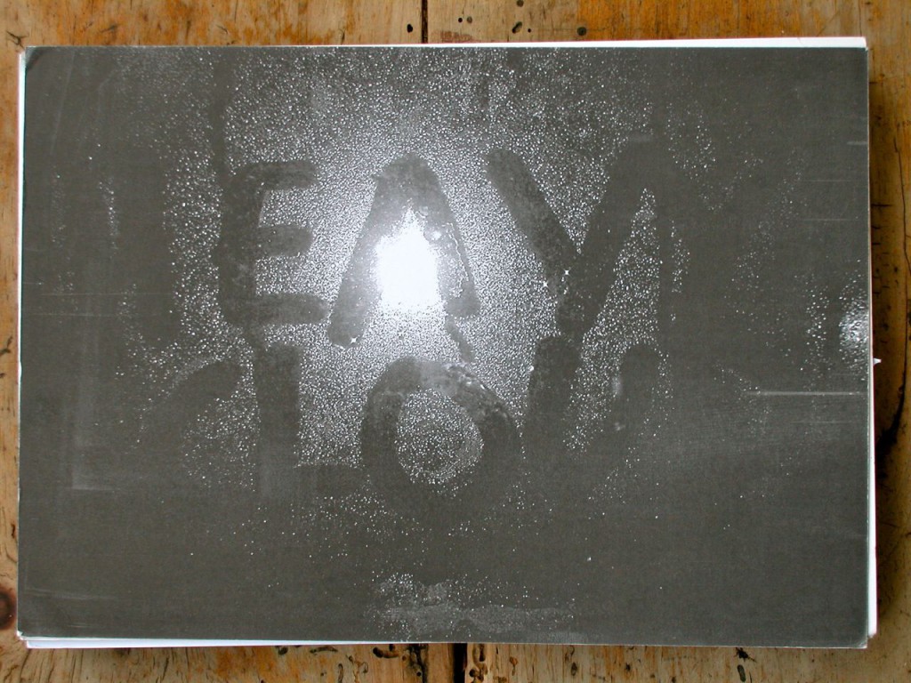
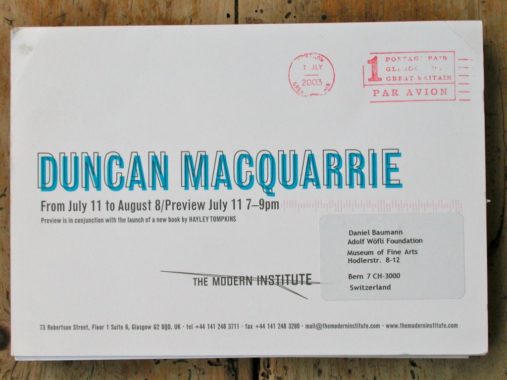
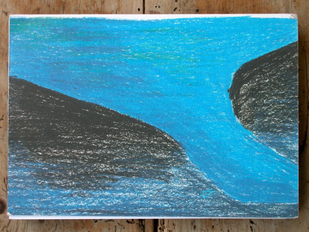

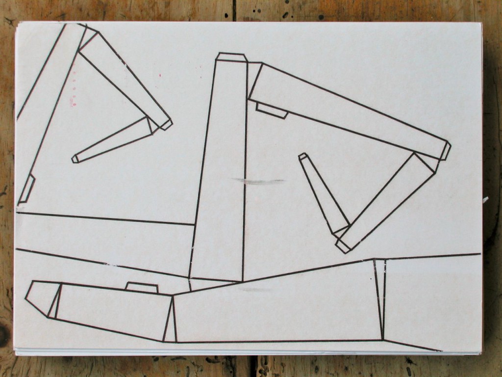
The Modern Institute/Toby Webster Ltd was founded by former Tramway director Charles Esche, writer and curator Will Bradley and Toby Webster in 1997 (Esche left in 1999, Bradley in 2001). In 2006, Andrew Hamilton became Webster’s partner. As Time Out puts it: “A perfect example of Glasgow’s internationally renowned contribution to contemporary art, The Modern Institute was once described by Art Review magazine as ‘a model for galleries around the world’.” The flyers were originally done on Riso in an old paper store in Glasgow called Nashes, hand fed into the machine. Until today, they keep their special appeal for their low quality, and their choices of colors, forms and fonts. They always reminded me of flyers for some obscure bands and concerts. More on the gallery’s history here. Daniel Baumann
 follow