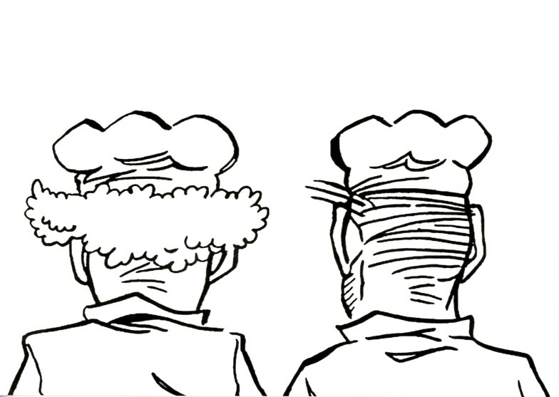
In 2006 The Drunken Bakers were the subject of a film by Mark Leckey (to be watched). Leckey created a film using frames from the original strips to construct a narrative and added a soundtrack spoken by himself and his colleague Steve Claydon in Liverpudlian accents. According to Emily Mears,
By fading the screen to black between episodes, Leckey constructs an elliptical narrative that mirrors the sense of time lost by the drinkers and the viewer. The video plays in a white box with a white carpet; a clock projected onto the outside of the box tells a stuck time, the hour hand slipping back to three each time it manages to reach four.
In Roberta Smith’s words, Leckey constructs “dreamy, druggy, disjointed variants on music videos…He has ingeniously filmed the comic strip with close-ups and jump-cuts, creating a kind of stop-action animation, and added a skillfully explicit soundtrack replete with convincing belches, slurps, breaking glass and vomiting.” Smith says that Leckey’s artwork is less an original work than an “adaptation or an homage” of the original cartoon. (as reported by Cabinet’s website)
Comment by a user Thomas Schlup: “‘Betrunkene Bäcker’ nannte sie Mark Leckey; mich erinnern sie aber an die beiden Jungs bei Busch, einfach ein wenig in die Jahre gekommen. Das waren vielleicht nur Doubles, die gemahlen wurden, und die Originale sitzen hier auf dem Bänklein vor dem Haus und erzählen dem Wilhelm ihre Missetaten aus der Jugend. Drei-Gupf-Hüte. Keck.”
Tim Rollins and K.O.S.
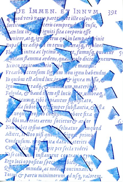
“What began in the 1980s as a program for South Bronx teenagers with learning disabilities grew quickly into a successful art collective called Tim Rollins and K.O.S. (Kids of Survival), whose works are in the collections of major museums. Now it’s composed of four middle-aged men: the brothers Angel Abreu and Jorge Abreu, Rick Savinon and Robert Branch.” Ted Loss in January 2021 in “The Kids of Survival Are Middle-Aged — and Transforming Yet Again” in The New York Times article.
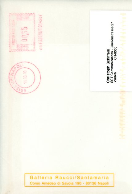
This invitation card comes from the Neapolitan Galleria Raucci/Santamaria (est. 1992) for their show in 2010, here some images. Tim Rollins died in 2017.
Comment by user Thomas Schlup: “Tim Rollins und seine Kids of Survival nehmen alte Drucke und befördern sie in die Gegenwart. Aus der South Bronx an den Fuss des Vesuv. Die Schrift: möglicherweise ‘Aldus’. Die erste Kursive Druckschrift. Aus der Zeit, als die ‘Bembo’ geschnitten wurde, heute noch eine der lesbarsten Schriften überhaupt. Aldus (Manutius) war der Namensgeber für die Firma mit dem ‘PageMaker’, als das Arbeiten am Computer noch Desktop Publishing hiess. Essentiell: das hauchzart durchscheinende Couvert.”
Raymond Roussel @ Buchholz
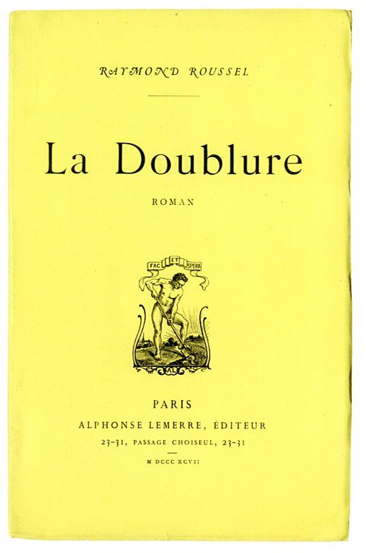
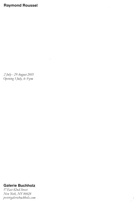
Galerie Buchholz shows more than a few brilliant artists. Sometimes, the gallery organizes shows that we would love to organize too — and we love Daniel and Christopher for doing so. In this case about famed French author Raymond Roussel who wrote New Impressions of Africa and Locus Solus. Check Buchholz’ shows on RR here and here. Roussel died in 1933 in a hotel in Palermo, the beloved Italian author Leonardo Sciascia wrote about it.
“Docilement une brillante fanfare éclata, sortant d’une foule de pavillons d’inégale grosseur tassés en groupe compact.” Raymond Roussel
Robert Kinmont
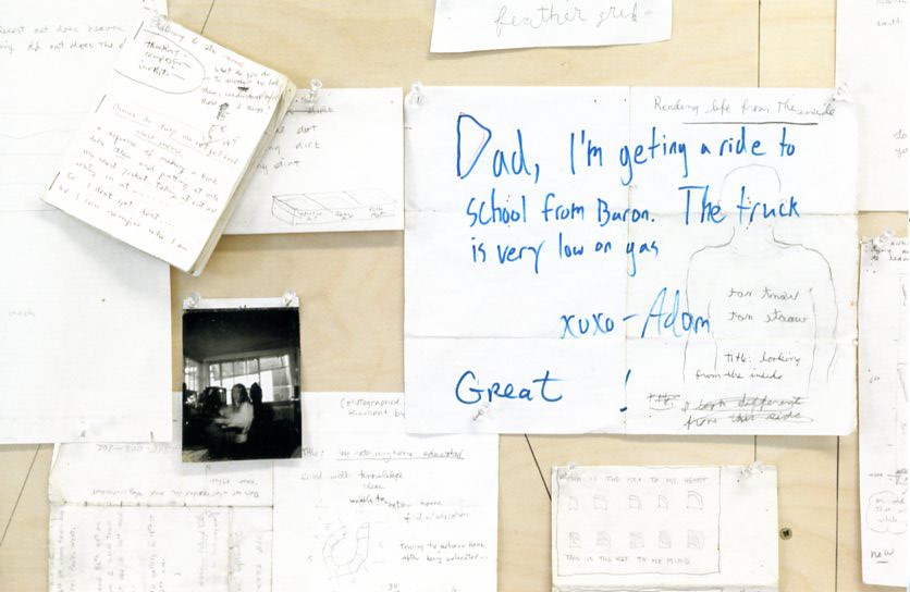
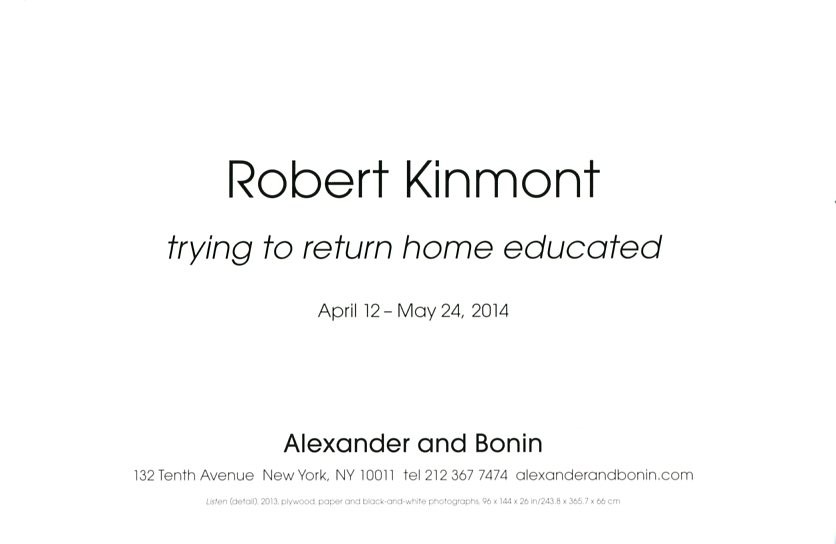
Robert Kinmont (b. 1937, Los Angeles) currently lives in Northern California. Between 1968 and 1981, he exhibited in galleries and institutions such as the San Francisco Museum of Art; the de Young Museum, San Francisco; the Smithsonian Institution, Washington D.C. and the 1968 “Sculpture Annual” at the Whitney Museum, New York. Between 1975 and 2004, Kinmont studied Buddhism and worked as a carpenter, returning to his artistic practice in 2005.
Exhibition announcement for this show at Alexander and Bonin.
Martin Honert
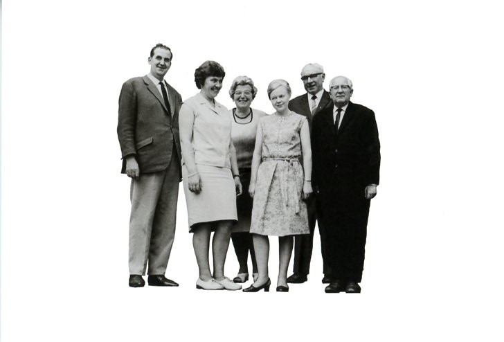
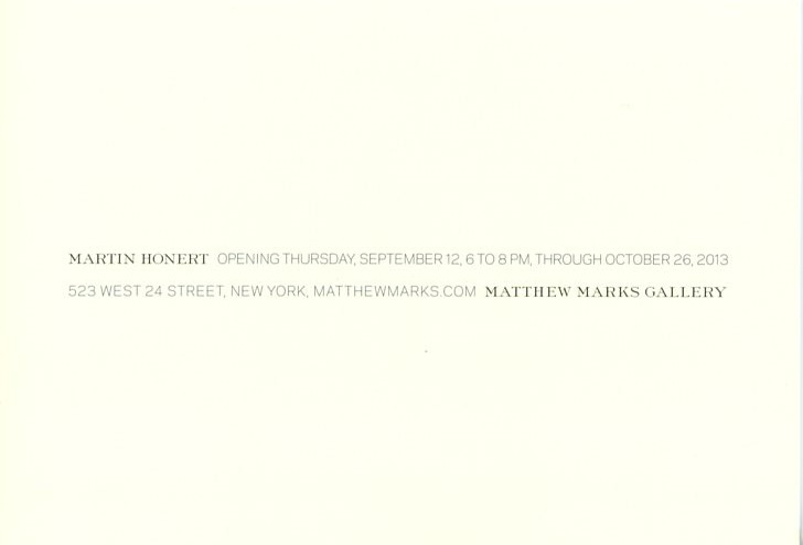
Martin Honert is a German artists born in 1953. He shows at the American gallery Matthew Marks. The gallery sends out some of the best invitation cards, and they certainly deserve a retrospective.
Thomas Hirschhorn
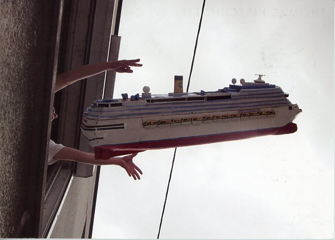
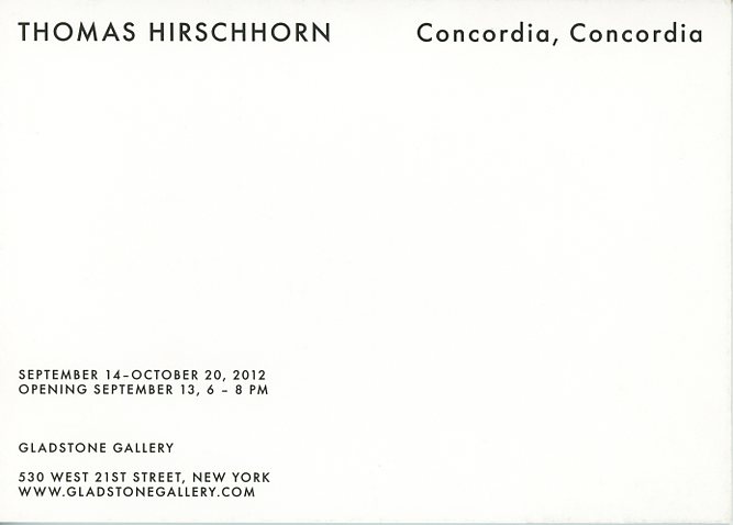
Thomas Hirschhorn’s invitation card for his exhibition Concordia, Concordia at Gladstone. On 13 January 2012 at 21:45, the cruise ship Costa Concordia stuck a rock in the Tyrrhenian Sea off the eastern shore of Isola de Giglio. 32 people died.
Press release: Gladstone Gallery is pleased to present the exhibition “Concordia, Concordia” by Thomas Hirschhorn. The exhibition features a large-scale work inspired by the sinking of the cruise ship Costa Concordia, which ran aground off the coast of Italy in January 2012.
Artist’s Statement:
As many people, I saw the pictures showing the inside of the sunken cruise ship Costa Concordia after the wreck. The floor emerging upright had become a wall, the wall was turned into a ceiling and the ceiling into the opposite wall. Every non-attached thing was floating in water, like a barricade in movement. A barricade made of all that points out the impassable and cumbersome inutility. I was struck by this apocalyptic upside down vision of the banal and cheap “nice, fake, and cozy” interior of the overturned ship. This pictures the uncertainty and precariousness of the past, of the present moment, and of the future. I saw it as an amusing and disturbing but nevertheless logical and convincing form. This must be the form of our contemporary disaster. This must be the ultimate expression of the precarious, which nobody wants to confront. “Get back on board, captain!” shouted the coast guard officer to the already safely landed captain of the Costa Concordia who refused to go back to his vessel. “Get back on board!” means there is definitely no escape – we have to confront the self-produced disaster in its incredible normality – there is no way out, there is no place to flee, there is no safe land anymore! This is the starting point that made me think of and start out to conceive the work “Concordia, Concordia.”
I want to do something Big. To do something Big does not mean to do something monumental or gigantic. If something is Big, it’s because it needs to be Big. One must understand that necessity as such or within its own logic. That’s why, when making things Big, I do it myself, with my own hands, with my own materials, with my own visual vocabulary and with my own work. I do it in order to avoid the “Blow-Up” effect and I do it to avoid falling into the trap of “Pumping the Size.” I want to do a Big work to show that the saying “Too Big to Fail” no longer makes any sense. On the contrary, when something is Too Big, it must Fail – this is what I want to give Form to. I want to understand this as a logic and this is the Form! This is what I want to explore, it is the grounding of my new work “Concordia, Concordia.” “Concordia, Concordia” brings back to mind the disastrous wreck of the cruise ship Costa Concordia and the images of the immersed ship in its confusing architecture. The flooded casino of consumption stands for evidence: the evidence of a coming disaster and the evidence of an announced failure. This is “Concordia, Concordia.” – Thomas Hirschhorn
Robert Adams
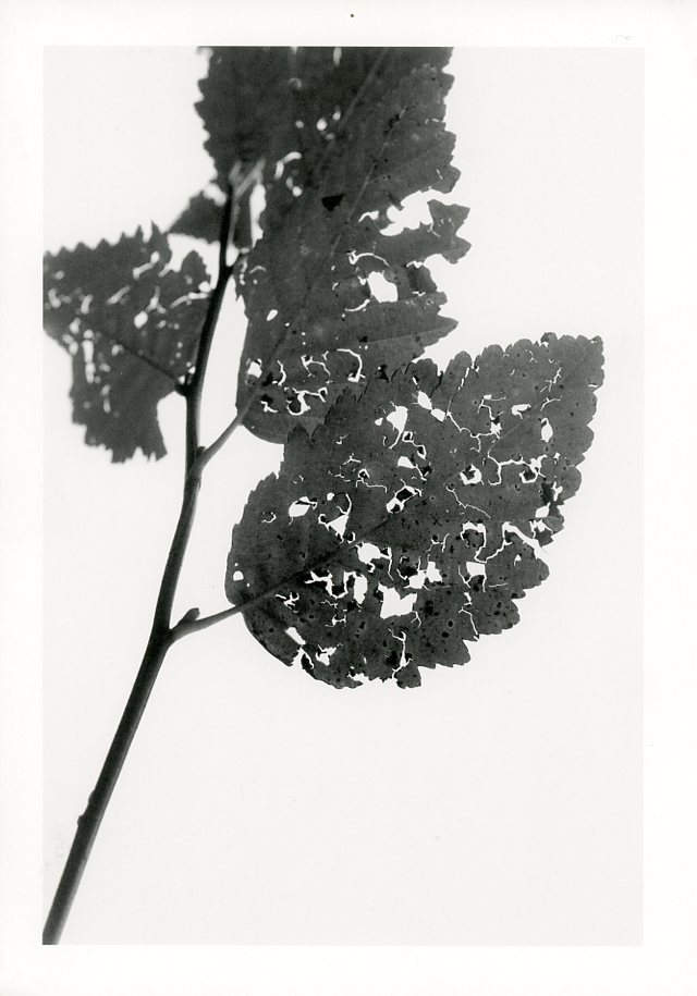
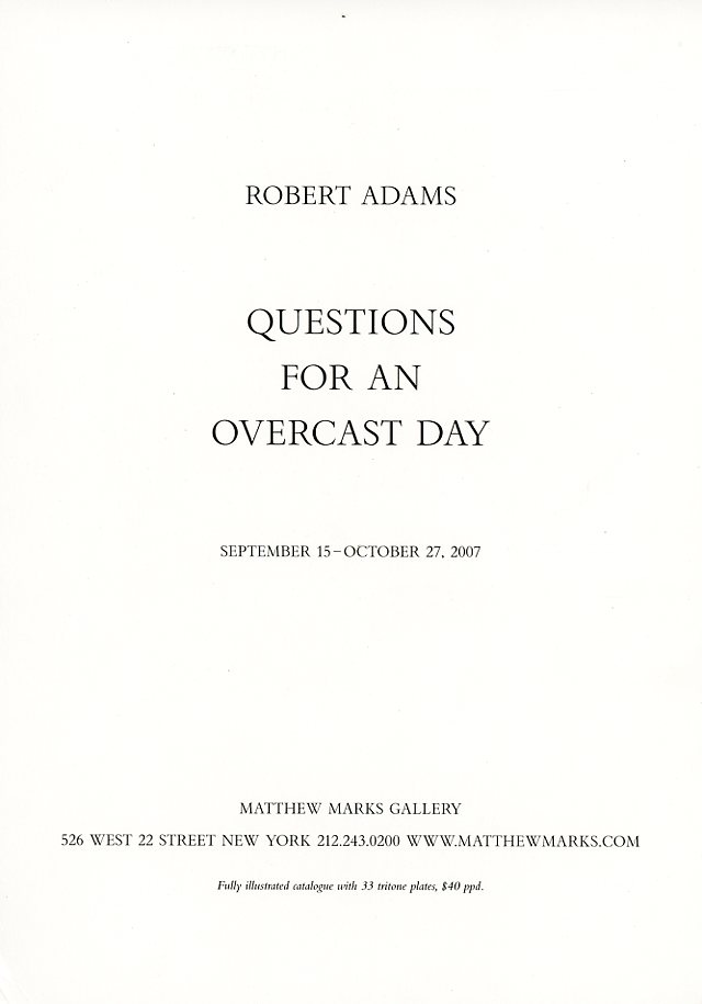
User comment b Katarzyna Nowak: “I like that someone took his time to photograph the details of this ephemeral moment.”
Nan Goldin – Scopophilia
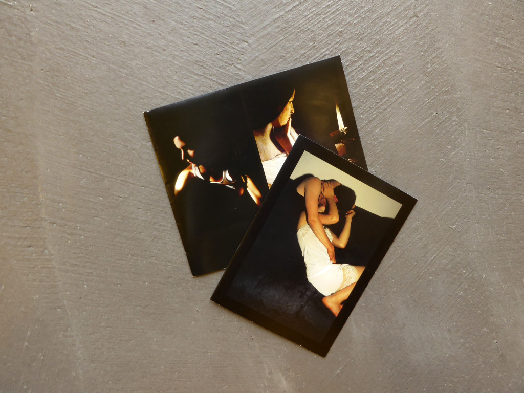
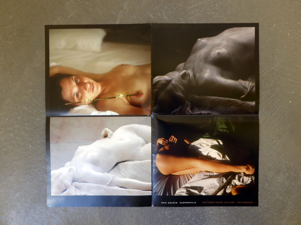
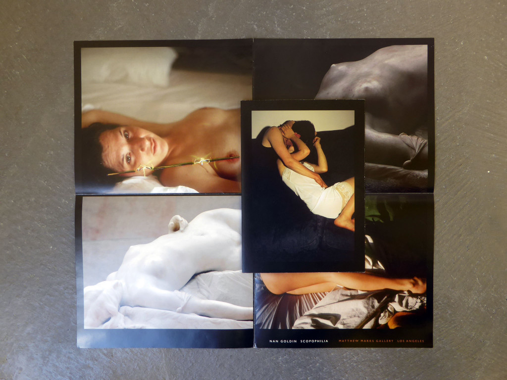
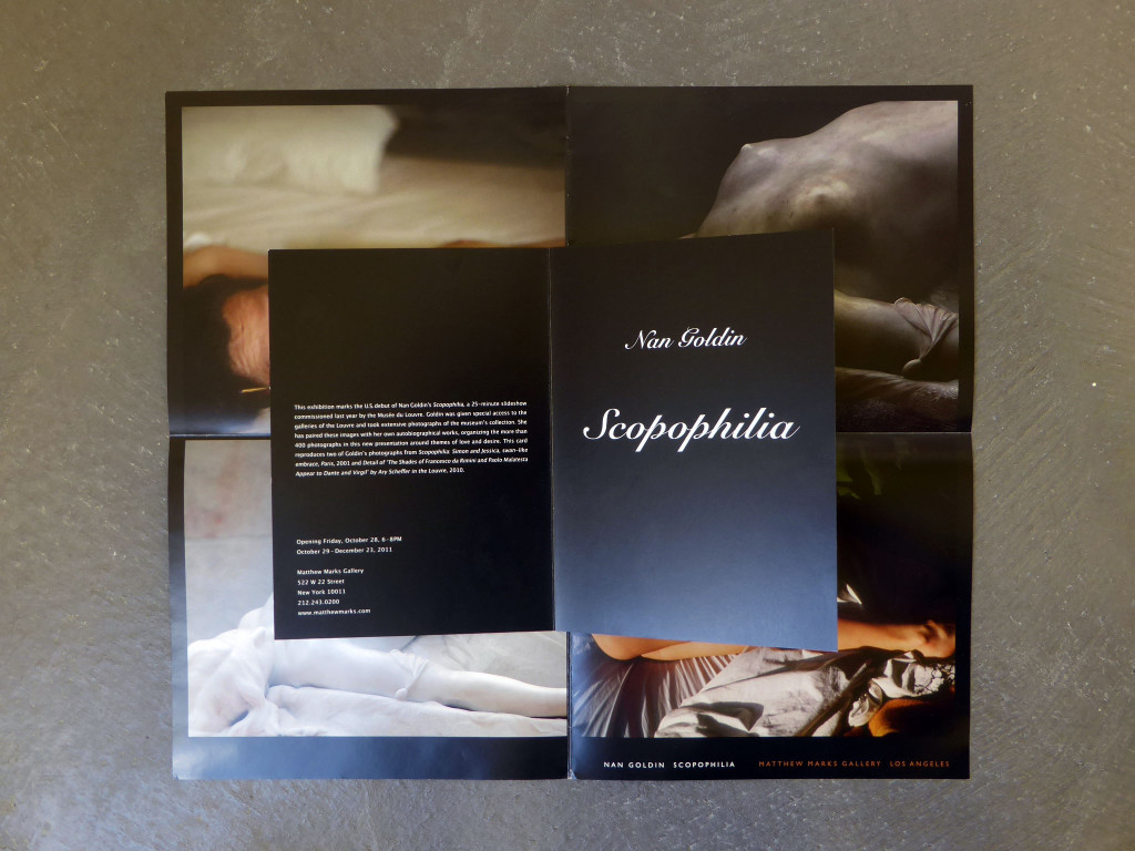
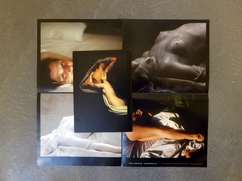
Invitation card and small poster by Nan Goldin for Scopophilia at Matthew Marks in 2011.
Donald Kuspit in “Nan Goldin. Tradition Envy“: “Writing about her series “Scopophilia,” which “pairs her own autobiographical images with new photographs of paintings and sculptures from the Louvre’s collection,” Nan Golding states that “desire awoken by images is the project’s true starting point. It is about the idea of taking a picture of a sculpture or a painting in an attempt to bring it to life.” That’s all very well and nice, but the Old Master sculptures and paintings she photographs don’t need to be photographed by her — or anyone else — to be brought to life, having already lived for centuries, not just in cultural memory, but in emotional memory, for they bring enduring meanings to life, which is why they will continue to live, long after Goldin’s photographs have died, along with the people she photographs, all emotionally shallow and undesirable and unlovable — the young unlovables of the youth culture (that is, of those arrested in their emotional and cognitive development, however physically developed and sexually active they may be) — rather than imaginatively reconfigured into mythical personae.”
Peter Fischli and David Weiss
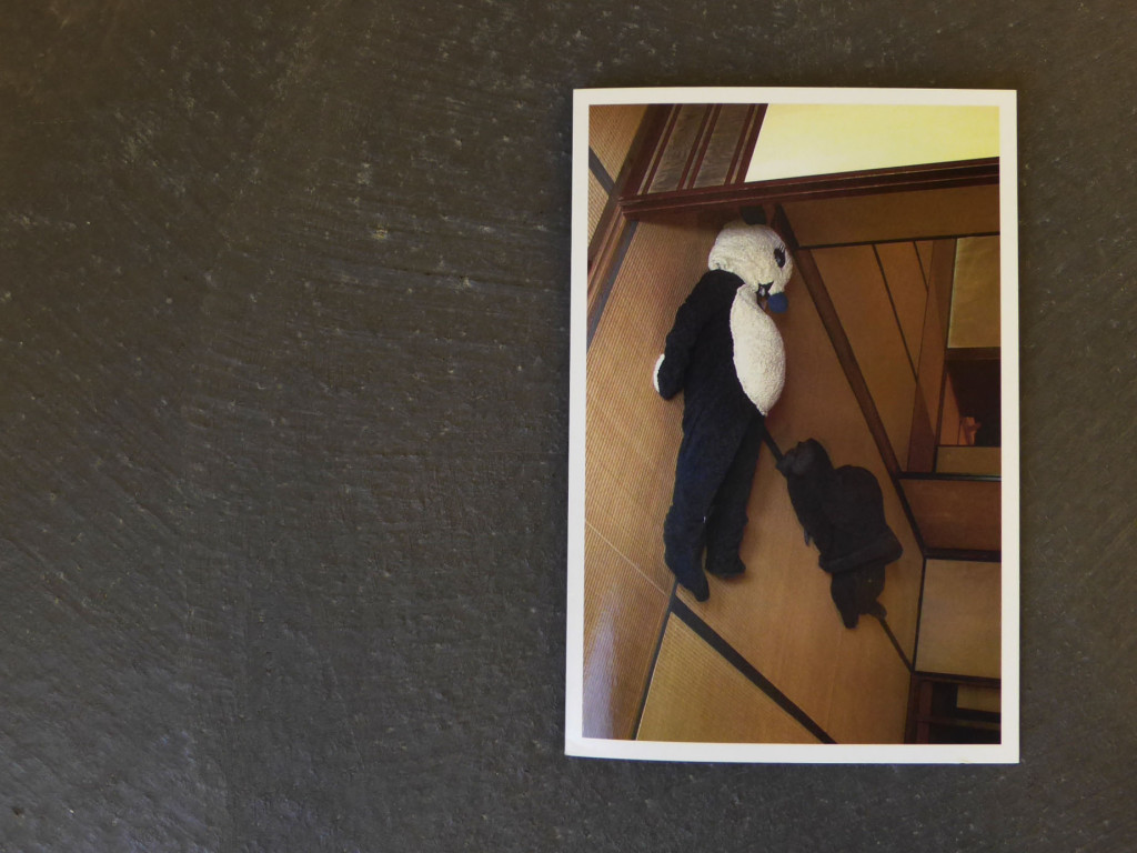
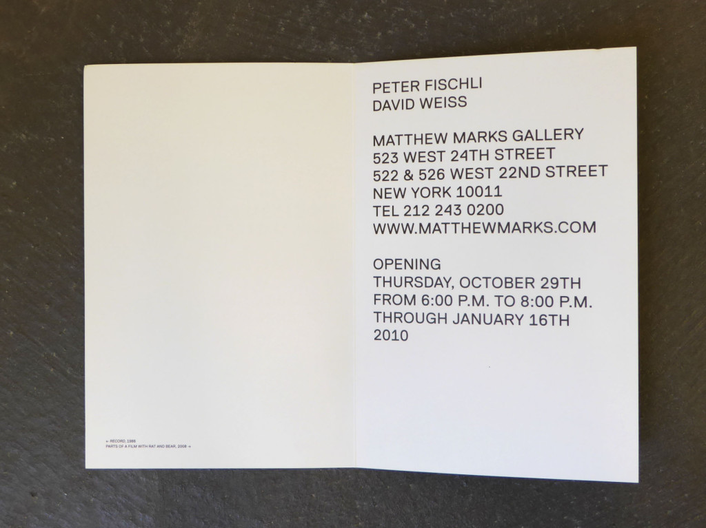
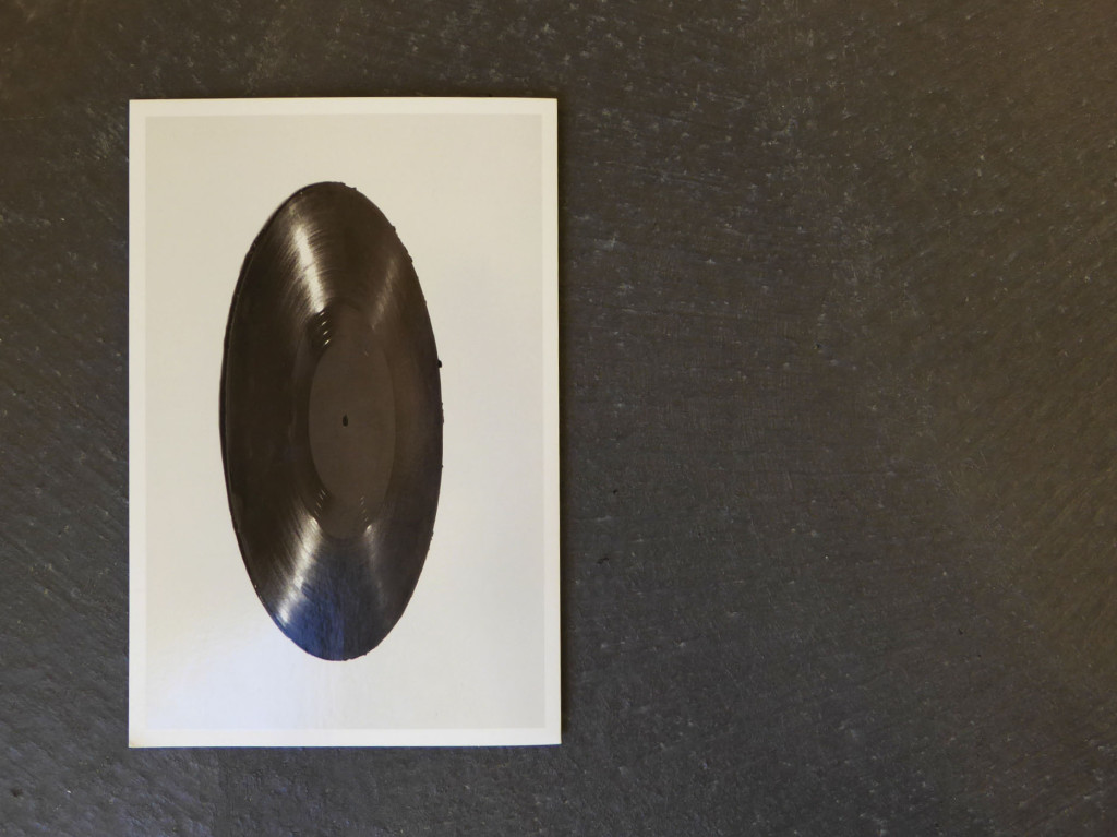
“Matthew Marks is pleased to announce a special exhibition of work by Peter Fischli and David Weiss at his three galleries. The exhibition includes the new monumental installation, Sun, Moon and Stars at 522 West 22nd Street. Clay and Rubber at 523 West 24th Street features their iconic sculptures from the past two decades in these materials, while their newest sculpture, Sleeping Puppets, will be installed at 526 West 22nd Street.” (press release)
Peter Fischli and David Weiss first show at Matthew Marks Gallery was in 1999. Before, they had shows at Galerie Stähli, Zürich (1983), Galerie Crousel-Hussenot, Paris (1984), Paris, Sonnabend Gallery, New York (1989), Galerie Walchethurm, Zürich (1992), Galerie Francesca Pia, Bern (1992), White Cube, London (1997),
Galerie Hauser & Wirth (1997), and, since 1983, at Galerie Monika Sprüth, Cologne.
Allen Ruppersberg
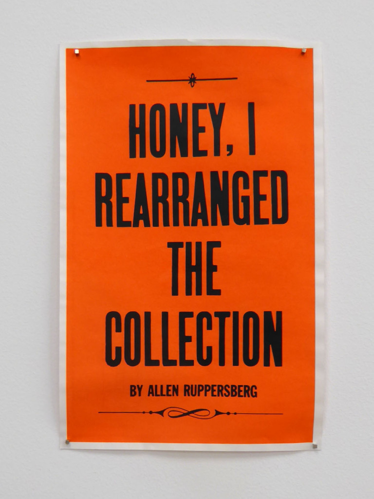
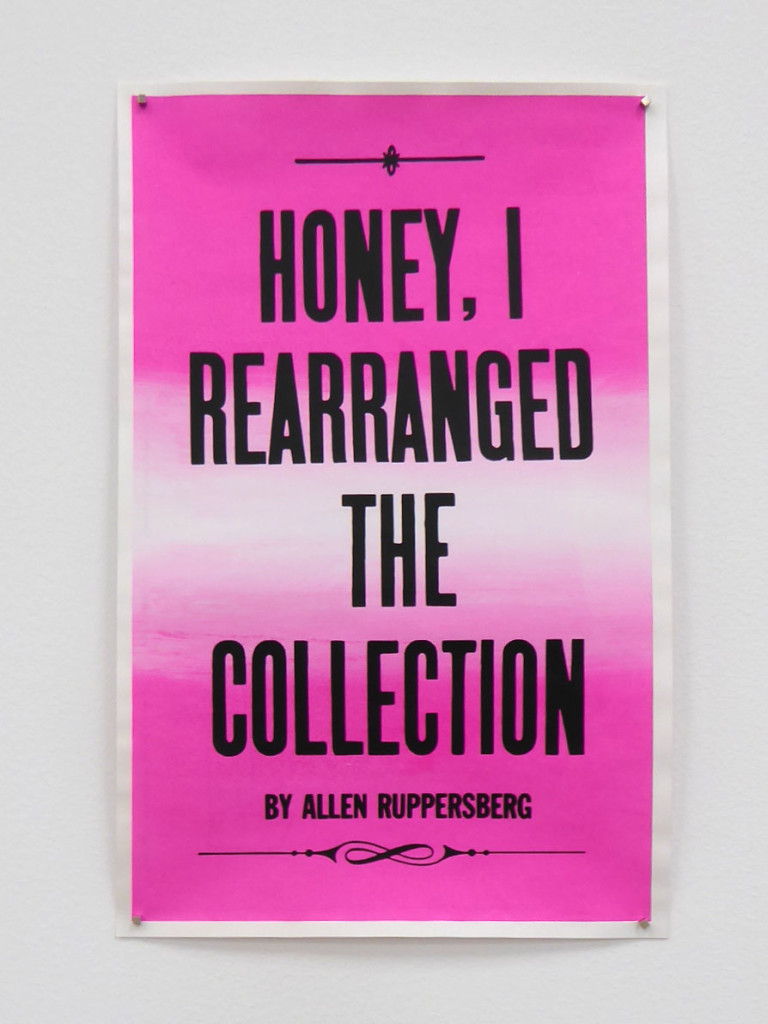
The American artist Allen Ruppersberg is certainly underrated. He belongs to the group of artists that may never achieve stardom nor produced a masterwork, except maybe his groundbreaking participatory environments Al’s Cafe (1969) and Al’s Grand Hotel (1971). His work connects time and space by gestures comparable to ephemera.
The Hammer Museum writes on their website: “Ruppersberg moved to Los Angeles in the mid-1960s with the goal of becoming an illustrator, but soon became active in an emerging scene led by artists such as John Baldessari, Ed Ruscha, William Leavitt, and others exploring the interface of language and image filtered through the lens of mass culture. His early projects—including environments made with found objects; wry, narrative photo works; and a novel copied by hand—began a career-long practice of creating works that prompt both reading and looking, and that intertwine fact with fiction.”
User comment by Marina Prodo: “I choose these particular prints because with simple typography and really strong color it has impact, shows a phrase (probably said by the artist) which has humor and it is almost saying (with other words) ‘You have to come or I’ll be deluded’. Also because the sentence ‘Honey’ made me smile! Like the simple and beautiful graphic design as well!” Buy it here!
 follow